Dating sites and apps are a great way to meet people, but with so many out there these days, finding the site with the right features for you is pretty important if you're not keen on wasting your time. There's Tinder's famous easy swiping, Match's longer profiles for the more serious daters, Hinge's prompts that help the conversation going — the list goes on.
So what about a dating site that can take you back in time?
To be clear, we're not talking about actual time travel, so much as the immediate burst of Facebook-circa-2010 energy that Zoosk offers upon loading up its website or app. That's courtesy of an interface and features that make it clear this dating site was one of the first Facebook apps back in December 2007.
While the other longstanding online dating players like Match, eharmony, and OkCupid have managed to (mostly) update to stay current and somewhat fresh, Zoosk's initial draw of making international dating simple and a matching users with a unique algorithm feels more and more gimmicky and unrealistic as the years go by.
Who is on Zoosk?
Allegedly, there are 40 million users on Zoosk across 80 different countries. If you're not trying to see the same 10 profiles within a 20 mile radius, these are pretty appealing numbers.
The age range of users seems to vary widely, too — from my two weeks on the app, I saw profiles from 21 year olds to 51 year olds. Users as young as 18 can sign up, and my age filter maxed out at 51, though users up to age 98 can also make accounts — I'm unsure why I wasn't able to adjust my age filters any higher. With that said, I'm not sure this app is great for older crowds. I'm in my mid-20s and I found Zoosk's interface to be kind of confusing. There are definitely better dating apps for seniors out there.

It's not the most queer-friendly dating app out there
When it comes to diversity of options for LGBTQ+ users, Zoosk could be doing a whole lot better. For starters, if you're interested in more than one gender, you'll have to take it up with Zoosk customer service, as there's no built-in option to select that preference on your profile. They'll then have to set you up with an additional profile. If you don't want to go through that process, you'll only get these four choices upon sign up:
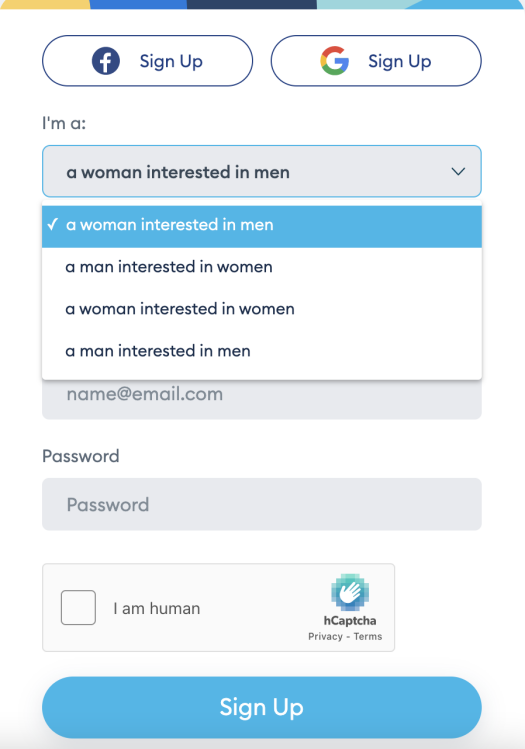
I'd just like to take a moment to speak directly to Zoosk — baby, it's 2022. I should not have to email your customer service team to a) change my preferences to switch my profile from seeing men to seeing women or b) ask you to pretty please allow me to see both — gasp — men and women at the same time. That should just be an integrated feature on your site, and there's no reason to have a needless hoop for any bi- or pan-sexual users to jump through. Speaking of, might be cool to recognize nonbinary people exist, too!
And it's got a bit of a bot problem
Forty million users is an impressive user base. But that impressive user base needs to be taken with a grain of salt: Dead or fake profiles seem to make up a decent portion of that 40 million. Now, Zoosk does have a huge collection of success stories on its social media and blog (though the latter hasn't been updated since 2020). If the person of your dreams doesn't message you back, you can tell yourself it's probably because they haven't logged on in two years.
If you're looking for more accurate numbers on how many users are actually using Zoosk, there aren't many out there. However, on The Date Mix, a blog owned by Zoosk, an article updated in 2021 mentioned that Zoosk has 3 million active users. During my two weeks, I saw a couple of repeat profiles pop up, leading me to believe the lower number is likely the more truthful one.
If you are wary of accidentally flirting with a bot, Zoosk does offer several profile verifications, including photo, Facebook, Twitter, and phone number verification. It's not uncommon to come across profiles that have none of these, but I would say about half of the users I came across were at least photo verified. Still, the chances that you'll get messages from clearly fake profiles aren't slim. Before I'd put in any pictures or my name on my profile, I had 34 people who were into me. While I'd like to believe my charm is just that potent, likely, it was bots.
Making your account on Zoosk
It makes sense that there are a lot of fake profiles because making an account on Zoosk is easy and takes at most five minutes.
Here's how it works: When you first log on, you can decide if you want to create an account from an email, Google, or Facebook account. Unlike more involved websites like eharmony or EliteSingles, you won't have to slog through a long questionnaire. Instead, you'll be prompted to fill out information that's pretty standard dating app fare: your location, preferences, education, ethnicity, religion, and so on. You'll also be prompted to pick a username, and if you can't think of any, Zoosk provides some creative options.

You also have the option to fill out a short bio ("My Story"), and some ice breakers about your ideal first date, and who you imagine your perfect match to be. Those prompts were a bit too on the nose for my taste — I don't know exactly what I'm supposed to glean about potential compatibility from someone who imagines our first date to be "enjoying a meal together" or whose perfect match is "happy." Other apps like Bumble, Hinge, and OkCupid have mastered the art of the more specific prompts that actually might reveal something about someone's personality, but I guess Zoosk's are good jumping off points for someone very new to the online dating game.
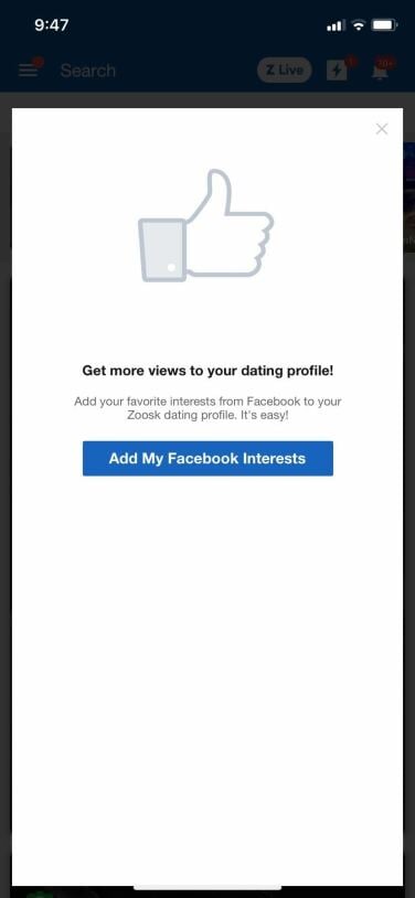
Finally, you have the option to fill out your interests when signing up, which was maybe the most early-Facebook the app ever felt, mostly due to the fact you chose your interests from the classic Facebook group pages. Again, knowing that you and a potential partner both have an interest in basketball, Rihanna, or FarmVille (the Facebook JUMPED out here), might be nice, but something about this feature doesn't give the sense it's inspiring a ton of robust conversation. If anything, it seems like Zoosk is holding on to the remnants of what used to be a winning formula, and aging itself in the process.

Verifying your profile
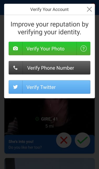
At this point, you can also choose to verify your profile and let other users know you're a real person. As mentioned above, you have a few choices about how to do this, with the most extensive being the photo verification. First, you need to have a picture uploaded onto your page.
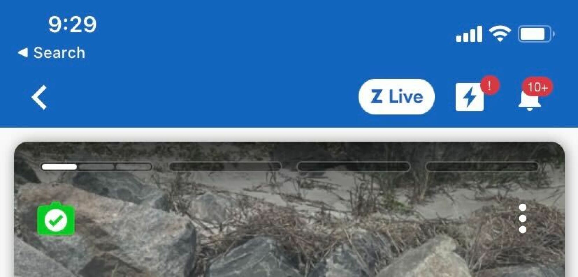
Then, you have to hold your smartphone at arm’s length and press record when prompted. It’s not as effortless as taking a selfie, but Zoosk wants to know if you’re an actual person holding a phone and not just placing a photo in front of its camera. The site will then ask you to turn your head to the right and then left, as if you’re taking a mugshot. Your photo is then sent to administrators, who will make sure that your "video" lines up with the one on your profile. Although it takes some time, you can now rest easy knowing your matches are real (or at least verified) when you see that green check mark on their photo.

The website is better than the app
For all the issues I've had with Zoosk feeling out of touch, I will say that the website does better than the app. You know when you open an old app you downloaded in like 2013, and the font is huge and doesn't fill out your whole phone screen? The Zoosk app doesn't do that, but it somehow still captures that energy. I don't know if it's the overly simple color-blocked header on pages or the basic font that looks like it was pulled straight from Microsoft Word, but this app feels old.
And despite the simplicity, it's difficult to navigate — I say this as a person who has never found a single other dating app that difficult to get around after a day or two of using it. Between the Connections, Online Now, Carousel, Views, Smart Pick, and (inexplicably) the Live stream pages, I felt overwhelmed and confused every time I wanted to look at people's profiles.
The website, though in some need of an update, looks much cleaner and more of this time. Something about the way buttons are highlighted, the spaces between page titles, and the way user profiles look makes it feel like this website has actually been updated post-2012.
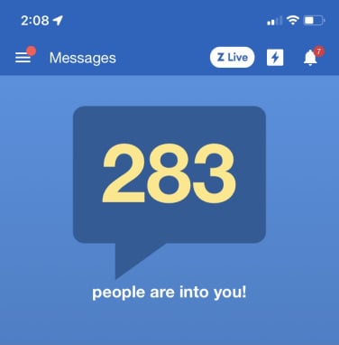
There were moments when I saw clearly the how the site was superior. When clicking on the app message page, I would be hit with the words, "283 people are into you!" and there is actually no world where that's not overwhelming.
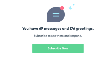
On the desktop message page, however, I was notified that I had "69 messages and 176 greetings," which was still a lot, but felt much more manageable (though the math didn't add up between the app and the site, which was interesting). Still, if I wanted to, on the site I could decide to only pay attention to the people that had bothered to write something out instead of those who sent just a heart or smiley face. The specificity helped, and made the entire experience feel less spammy.
The Zoosk algorithm
So if it's confusing and outdated, why would anyone use Zoosk? Well, its "Behavioral Matchmaking" algorithm is supposed to be great. Basically, the more people you like and pass on, the more Zoosk learns about what kind of profiles you're looking for. This used to be a novel idea, but these days, it seems that's how most dating app algorithms work.
One place you can teach the app is the Carousel feature. It functions similarly to Tinder with swiping to send a like, pass, or say maybe, but you don't get to see beyond one picture on the person's profile when making your choice. I get this is supposed to be the more "rapid fire" section, but it felt restrictive for no real reason. If I wanted a barebones Tinder experience, I'd go on Tinder to swipe on people who didn't bother to fill out their profile. I also had to sit through short video ads every few swipes, which again, made it feel less like a serious dating app and more like a cheap, old mobile game downloaded on an iPod Touch.
You can also inform the app through your daily "SmartPick" choices, which is where the algorithm is really supposed to kick in to high gear, combining profile preferences and how you interact with other user accounts to find your perfect matches. Limiting to 10 daily picks made this one of the most simple and effective ways to look for other users on the app. If I were a regular Zoosk user, I imagine I'd just bother checking this page to avoid sinking hours of my time.
With that said, I didn't see any verification checks on the profiles presented to me through the SmartPicks. I don't think it's because they were all on unverified, but because the profiles themselves were laid out differently in this section, and the verification checks didn't make it over, which is a huge oversight when a website has its share of fake profiles.
Notifications on Zoosk
As I mentioned, there are a million (seven) main pages to interact with on Zoosk, which means it's beyond easy to rack up notifications. I am the type of person who can't stand when I'm unable to make the little red bubble go away from any app I use, whether it be iMessage or my email. As a result, Zoosk became my personal hell.
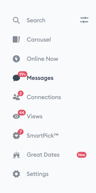
Let's start with the "Views" page. What I have learned is I have no interest in knowing who has viewed my profile, especially if they've not interacted with it, because it leads to so many unnecessary notifications. Some apps have the (usually paid) feature of showing you who has liked you, which feels like a much better version of seeing your views. Ultimately, I am not a YouTube video, I don't care about my view count.
Next, the push notifications. I got a notification that someone was "curious" about me, and I still don't know what the hell that means. I got notifications about profile views, when I had a connection, when my SmartPicks were ready, when people who I'd never exchanged a single message with wanted to meet me, and so on. There are two kinds of push notifications I want with a dating app: when someone matches with me, and when someone sends me a message. Simply put, it was way too much and made the entire process feel less engaging.
The messaging experience
You don't have to match with people on Zoosk to send and receive messages. Zoosk even offers some pre-written messages to help you get the ball rolling. However, you do have to have a subscription, and thus pay money, to message most users. You can respond to any premium messages you receive for free, but for most messages you'll receive, you have to pay to see what was said and respond.

Obviously, that presents a problem for ever clearing out your notifications if you want to continue using this app for free.
One part of messaging that didn't cost money (at least for the first and only time I tried it) was Super Send, which allows you to send a mass message to a bunch of users to get some conversations going. If you don't think about too hard, this sounds like it could be nice for making a connection, and if you think about it a little more, it sounds awfully similar to a spam message.
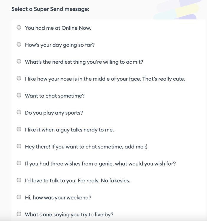
Yes, it can take a lot of patience and effort to start talking to someone you really hit it off with. But that patience and effort is kind of essential for making an authentic connection. Sending a pre-written "Want to chat sometime?" selected from a bulleted list doesn't go a long way when you're trying to intentionally date and get to know people.
You're paying for the basics
For most parts of the app, such as liking people that have viewed your profile, matching with your SmartPicks, and messaging users (as mentioned above), or use the integrated "Great Dates" video chatting, you have to be a paying member of Zoosk. So what exactly does that cost you?
One month membership: $14.99
Three month membership: $24.99
Six month membership: $74.99
Compared to other apps, Zoosk's prices aren't outrageous — in fact, they're cheaper in many cases. One month of OkCupid will cost you $14.99 too, one month of Hinge $34.99, and one month of Match can run you close to $50. What's more is Zoosk's prices have gone down in the past couple of years. However, its subscription fees would be way more competitive, if it had the features and user base these other apps and sites have, to back up what it's trying to sell.
OkCupid and Hinge both have fully functional free versions, and Match has a user base that knows it's looking for something serious. Zoosk feels confused in comparison, with its swiping feature and quick sign up that make it seem casual, along with its space for a full profile and marketing about finding love that make it seem serious. Having users pay to experience most of the app also lends an air that this is not the place for hookups or uncommitted dating.
But it's not clear if that is 100 percent the case, and there are way more bot profiles than on the other websites. When there's no straightforward messaging as to what you're even supposed to be paying for, it makes you wonder why you would pay in the first place.
Let's talk about Zoosk coins
It used to be that much of the app was free, and you could use Zoosk coins to pay and access special features. Now, you have to subscribe to use many features, and you can pay extra for coins.
With coins, you can "buy" matches virtual gifts, browse anonymously, and see read receipts (though you do need a subscription on top of using coins to do this last item.)
You can also use coins if you're feeling impatient — the "Boost" feature puts your profile front and center for all users in your area to spike your views (and hopefully your matches), but each boost costs 100 Zoosk Coins.
Here's what that means in real money:
180 coins = $19.95
480 coins = $39.95
1800 coins = $99.95
To Zoosk's credit, coin prices haven't gone up in the past few years, and the same can't be said for other sites and apps prices in the same time frame. However, the very existence of coins to access features on top of a paid subscription does feel like a rip off in and of itself.
Data breach issues
Outside of the app experience, it's important to note that Zoosk has run into some legal trouble. In 2020, they faced a negligence suit after a leak of 30 million users' private data. Spark Networks, the company that owns Zoosk, had sent emails to those affected by the leak, but some users feel it was not within a reasonable time frame. It's been reported that the original notice sent to affected users stated that Zoosk was unaware of the breach until it was publicly reported.
Is Zoosk worth trying out?
Zoosk's pricing structure is on par with other dating sites, but not competitive enough considering all of its flaws, especially when it comes to its subscriptions and coins system. While paying for upgrades makes sense for "freemium" games like Clash Royale, Pocket Frogs, and The Simpsons: Tapped Out, it just doesn’t always make sense for a dating site — especially one that's essentially making users pay to weed through tons of seemingly dubious profiles.
To add insult to injury, this app doesn't have the active user bases of other options out there. To be fair, every dating app has its share of problems with bogus and inactive users — it just seems like they’re more prevalent here.
It also never felt entirely clear who this app was for, which seems to make it a subpar time for everyone. In my experience, the best apps are the ones that know they're for casual dating or serious dating or even something in between, and fully lean in to that identity with features that cater to those experiences.
Zoosk, on the other hand, wants to be the best of all worlds, but ended up feeling like the mediocre option for most. Sure, there seem to be some people who've genuinely found love on the app, but it's still hard to name it a top choice for anyone. All I can really imagine is if you're opposed to the idea of being on a Match Group-owned app, Zoosk is technically there. Just don't expect it to wow you.
Topics Dating Reviews Sex & Relationships


